Imagine scrolling online, and coming across an image with the only visual being represented by a grey box with the word “image” displayed. People in the low vision and blindness communities do not have to imagine this dystopian online presence. Sadly they are not even the only disability community that is often overlooked in online representation. Simply put, Digital accessibility is lacking, and this needs to be adjusted immediately.
Accessibility can be an overwhelming topic for those who have limited prior knowledge of its benefits and importance. Understandably there is no science for producing accessible content, as no two disabilities are the same. They are as unique as the individual themself.
Schools and institutions seldom express access to proper use and leave media students in the dark about ways to produce accessible content. From producing journalism pieces to social media posts, everything must be considered with accessibility in mind at the beginning of the creative process.
Phrases like “Show, don’t Tell” limit the accessibility for people with blindness or vision loss. When creating visual content ensure there are at least two ways of interpreting the information. If you plan to show, use evocative audio to further explain what the visuals include. It does not have to be exactly described by a third party voice but it does have to be understandable for all audiences.
Before diving further into the ‘complex’ topic of accessibility, understand that accessibility means providing everyone with equal access to content and the opportunity to take away a clear understanding of the material without compromising their dignity. Accessibility doesn’t just help those with disabilities, it assists people who live in rural areas to obtain the same opportunity to view content. Individuals of all financial backgrounds have access to the content and individuals who have difficulty understanding complex language to ensure the content is written at a universal level. Accessibility generally helps everybody conveniently access content for their unique needs. However, for people with disabilities; these features are a necessity for them to access and consume the content.
“We also live, and let’s be honest, we live in a sighted world. The world does not revolve around blind people and it shouldn’t. But, we have to be included and the steps companies and organizations can take to make their products more accessible.” said the co-host of Double Tap and Access Tech Live on Accessible Media Inc., Steven Scott.
Many media platforms have accessibility laws written into their framework, such as Bell Media. Their accessibility plan dictates, “BCE is committed to treating all people in a way that allows them to maintain their dignity and independence. Our purpose is to advance how Canadians connect with each other and the world – including persons with disabilities. An important part of doing this is to identify, prevent, and remove barriers experienced by persons with disabilities.”
When it comes to accessibility, “Everyone is entitled to the same, no matter whether they have a disability or not.” This is further proof that accessible standards are here for everyone of all abilities to ensure inclusion from commencement to the final stages of everything public. Said by Jim Tokos, the National President of the Canadian Council of the Blind.
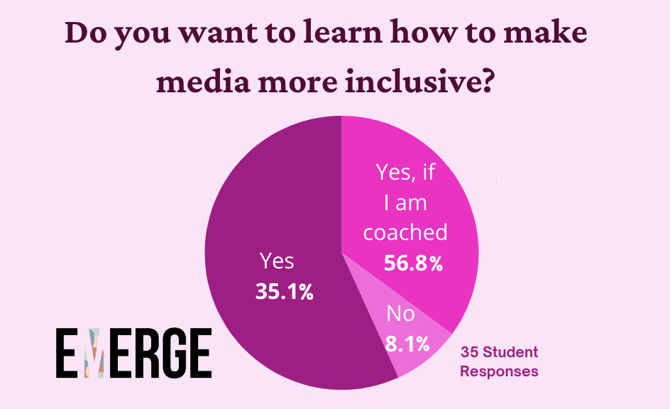
If you are still confused about applying your knowledge of accessibility to the work you produce, you are not alone. “We heard that employees want more information and resources on assistive technology at work.” CBC admitted similar to the students at the University of Guelph-Humber. In a survey with 37 responses, 56.75 per cent of students said they were interested in learning how to make their media more inclusive. Similarly, 35.14 per cent would be interested if they were coached on the process.

Accessibility can be challenging as no one person can speak on behalf of everyone’s unique needs. Creating an accessible design in media is really about listening to and implementing changes from user feedback. “There is an assumption that if you’re disabled, you know everything there is to know about disabilities. And you don’t. I know about my eye condition, my blindness.” Scott continued, “I don’t speak for blind people, I speak for myself.” Scott emphasized the importance of listening to individual people with disabilities to understand their unique experiences because everyone is an individual. “I can’t speak for someone who’s in a wheelchair and I can’t speak for someone who’s deaf. I can’t also understand or know what their experiences of disability are like compared to mine. I wouldn’t want to even attempt to try and work out a comparison. It is not appropriate for me to do that.”
This is why it is indispensable to have an accessibility feedback forum on your websites, not only is this legally mandated by the Accessible Canada Act, but it is beneficial to learn how to input constructive criticism into your content to make it more widely available.
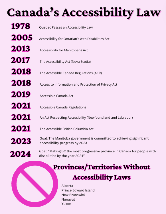
This knowledge about accessibility information is vital to media success, not only because it is the ethical thing to do but because our world is changing, and it is the necessary thing to do. According to the Government of Ontario Accessibility Action Plan, Ontario will be fully accessible by 2025 — next year. However, it is questionable whether or not this timeline is accomplishable in the current state, but as media students our goal should be to uphold this ideation of an Accessible Ontario by 2025; as it will be the stepping stone to Canada’s overarching goal of complete country accessibility by 2040.
Accessibility can be challenging as no one person can speak on behalf of everyone’s unique needs. Creating an accessible design in media is really about listening to and implementing changes from user feedback. “There is an assumption that if you’re disabled, you know everything there is to know about disabilities. And you don’t. I know about my eye condition, my blindness.” … “I don’t speak for blind people, I speak for myself.” Scott continued to emphasize the importance of listening to individual people with disabilities to understand their unique experiences because everyone is an individual. “I can’t speak for someone who’s in a wheelchair and I can’t speak for someone who’s deaf. I can’t also understand or know what their experiences of disability are like compared to mine. I wouldn’t want to even attempt to try and work out a comparison. It is not appropriate for me to do that.”

Screen Readers
When it comes to affixing accessibility standards to your work, ensure your written work is legible for screen readers, like Job Access With Speech (Jaws). According to Jaws, the written content has to be free of obstructions such as overlapping images and graphics and must be able to be highlighted with your cursor. If your content passes the highlighting test, it should be readable for the program to function for those who have JAWS enabled on their device. Unfortunately, this software costs upwards of $90 a year. It is also very important to use the proper text options when creating written work, when creating a title; use the title option for font boxes. "Ensure that proper heading tags are used to enable JAWS users to quickly move to specific sections in your content. Many times, authors will use bold and other styles to make some text visually look like a heading, but JAWS will not identify it as a heading since the correct markup to explicitly call out the text as a heading was not used." According to Corneliu Hoza, the Managing Director at Optelec Canada Inc..
To make your content more convenient for people who can not afford this service, you can always include a pre-read version of your written work for individuals to listen to as they follow along. This feature will benefit many more people than those with vision loss, as individuals with Attention Hyperactive Deficit Disorder (ADHD) may also benefit from this addition.
Alternative Text (ALT Text)
To ensure images are accessible for people with low vision and blindness, it is important to include an ALT Text description. This is a short description of the important information the image is conveying to the audience. “The alt text should be the most concise description possible of the image’s purpose.” According to the Web Accessibility Initiative (WAI).Of course, we have all heard the saying, “A picture is worth 1000 words,” but in accessibility terms, it should be around 150 words maximum. Look into the image's most important message and strictly describe that.
Describing a person: Say their preferred gender, their race, hair colour, and eye colour. You will often hear individuals who are blind describe themselves to other individuals with low vision, as this information may not be a given.
Describing an advertisement: Describe the product or service and highlight the business name, product name and contact information. Ensure you are rewriting all the text used in the graphic as well.
Describing a regular image: Let's say you post a selfie, alone or with others, be sure to clarify. Provide names and short descriptions of the people represented from left to right.
There is nothing more frustrating than scrolling through your feed and having a blank image appear with the word “image” to describe the blank space for individuals. ALT Text is quite easy and takes little time to ensure everyone can access the same information. Practice makes perfect, and if you are taking all the appropriate measures you can to ensure your content is accessible, no one will be upset with you. The most feedback you might receive is ways to improve your descriptions. This will always be beneficial, as technology advancements are not linear, nor is our understanding of accessibility.
Captions
All videos should have captions. Many applications (apps) like YouTube and TikTok auto-generate captions on your behalf. Allowing this auto-generation takes no time of yours and allows more people to access your content. Understandably, transcribing is a difficult and time-consuming task, but there are now free artificial intelligence (AI) websites that will complete this task for free. The Accessibility for Ontarians with Disabilities Act outlines 10 reasons captions will assist your online identity, firstly they “Meet or exceed compliance with the W3C Web Accessibility Guidelines adapted by many state, provincial (AODA in Ontario) and federal governments.” Not only is this feature mandated, but captions will also assist because they, “Make your content fully accessible to people who have hearing loss”. Furthermore they, ‘help people who are learning a second language, teach viewers the proper spelling or names and more, the captions can even help your work using search engine optimization (SEO). While only five reasons have been provided here, you should see how captioning videos help both viewers and content owners.
Adding captions makes your work more widely accessible for people who are deaf or hard of hearing. To go above and beyond you can add an American Sign Language (ASL) interpreter to the bottom of the screen, but this does not remove the need for subtitles.
Clear Navigation
Clear navigation is key, not only in terms of accessibility. It also improves the look of your website and builds trust with your audience. The most important information should be stored in the heading navigation with the footer reserved for less accessed items like copyrights. Clear navigation is an integral part of any trustworthy site, account or online identity. Remember to use proper labelling and font titles to ensure readers know where everything is located and the right information is being portrayed. Like Hoza Said, titles need to be written in a title block, not just bolded or enlarged.
Colour Contrast
Colour contrast is a feature that will and has helped everyone. Just think about any time you are on your device outside, you need the brightness all the way up to see what is on the screen; and when you are reading at night, having a black background and white text makes the screen easier on your eyes. Having your typical website look with an inverted option is simply put, a nice feature for everyone.
You have also probably seen posters with low-quality contrast, making them extremely difficult to read. That is a clear example of inaccessible design. Instead, choose a colour scheme with a colour contrast with a ratio of 1:3.5- 1:5. If you’re in doubt, you can never go wrong with black and white.
“Color contrast impacts the readability of your content on the web and in print. It is especially important for users who are low vision or for users who are colorblind.
Good color contrast means all users can see your content no matter the device they’re using or the lighting of their surroundings.” Said the Digital Accessibility Office at the University of North Carolina at Chapel Hill.
Social Media
As you can see, incorporating these features into your media is quite simple and makes your content more widely accessible to everyone, not to mention more convenient. “While accessibility features like captions and keyboard input are helpful for all users, they make all the difference for many people with disabilities who might not be able to access technology without these features.” According to the IEEE Global Initiative on Ethics of Extended Reality (XR) Report.
Emerge has provided simple app-specific tutorials below to learn more about shifting your online identity to become more accessible on social media.


